Description
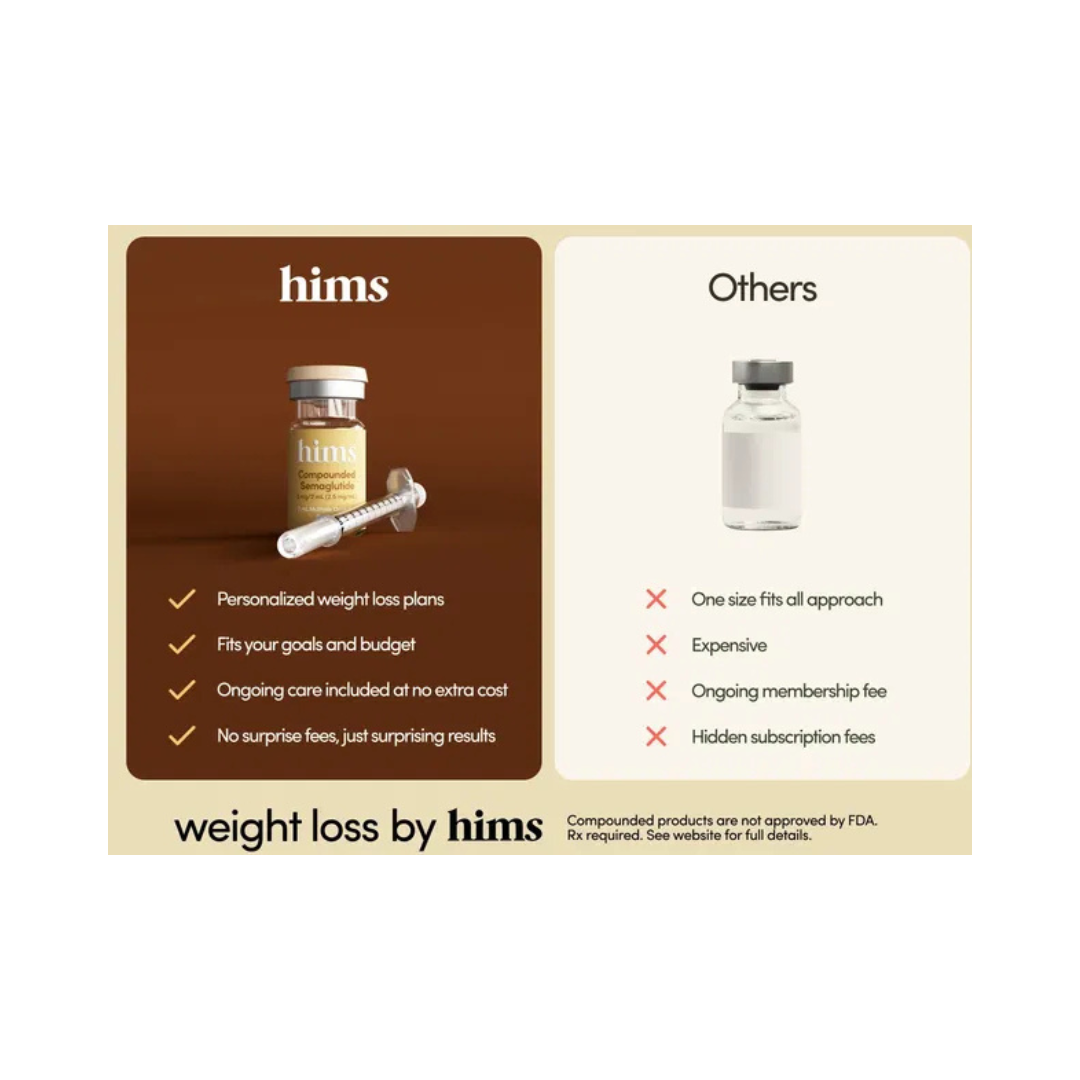
This ad draws a clear line in the sand, on one side, you’ve got “hims,” offering weight-loss plans that feel personal, thoughtful, and human. On the other side, there’s the vague, generic “others,” a blank bottle that basically screams, “We don’t know you, but here’s the same thing everyone else gets.” The visual split is clean and intentional: warm, reassuring energy versus cold, clinical indifference. The message is simple, your body isn’t generic, so your weight-loss plan shouldn’t be either.
How It Works:
It’s comparison marketing done smartly. Instead of cluttering the ad with scientific claims or complicated explanations, it uses contrast to tell the whole story. Tailored vs. one-size-fits-all. Transparent vs. full of fees. Supportive vs. distant. The viewer instantly understands what makes “hims” different without needing a deep dive. It’s relatable because everyone has felt the frustration of being treated like a number, not a person.
How You Can Reuse It:
Find your “others.” Show the difference, don’t just talk about it. Use visual simplicity to make the gap obvious, then anchor it with a message that speaks directly to real frustrations people already feel. When your brand positions itself as the thoughtful alternative to an impersonal system, customers lean in. They don’t just buy the product, they buy the experience of being understood.