Description
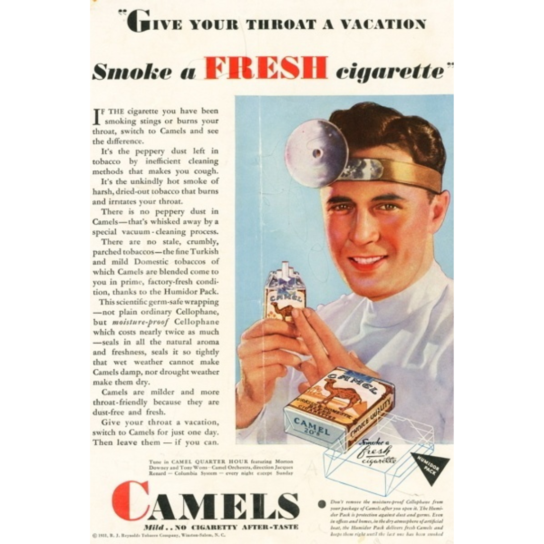
This ad speaks the language of reassurance. It’s aimed at people who already smoke but are tired of the discomfort that comes with it. Instead of selling excitement or rebellion, Camel sells relief. The headline feels almost medical, almost caring, like someone noticing your irritation and offering a gentler alternative. It reframes smoking not as indulgence, but as something that can be improved.
How it works
The ad leans heavily on explanation and authority. The doctor imagery, the detailed copy, the talk of “cleaning processes” and “freshness” all work together to make the product feel safer, cleaner, and more considered. Camel positions itself as the thoughtful choice, the cigarette that understands the problem and has engineered a solution. It’s not flashy persuasion; it’s calm, logical comfort.
How it can be reused
This structure works whenever a product is trying to win over people who are already frustrated with the status quo. Start by naming the irritation your audience feels. Then introduce your product as the more considerate alternative. It’s especially effective in categories where trust, care, and reduced discomfort matter more than hype. When people feel understood first, they’re far more open to switching.