Description
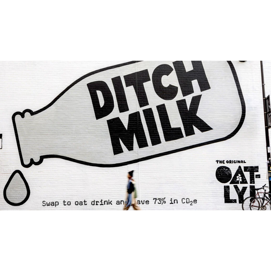
This Oatly mural doesn’t whisper, it interrupts your walk, grabs your attention, and hands you a message as bold as its lettering: “Ditch Milk.” The design is stripped back to the essentials, a giant bottle outline, two words that hit like a dare, and a tiny line of text beneath that casually mentions saving 73% in CO₂ by making the switch. It’s the kind of ad that blends into the city while standing out from everything around it.
How It Works:
The success of this mural comes from its punch-in-the-face simplicity. Big, blocky typography dominates an entire wall, turning the message into an unavoidable declaration rather than a suggestion. There’s no emotional manipulation, no dreamy imagery, just a direct call to action delivered with Oatly’s signature “say-it-like-your-friend-would” honesty. The eco-benefit tucked underneath acts like a quiet mic drop, giving the bold message substance.
How It’s Reused:
This approach, oversized message, minimal visuals, human tone, is endlessly adaptable for brands wanting to sound real instead of rehearsed. Take a strong point of view, scale it up, put it in a public space, and let the environment become part of the storytelling. Anything can work: climate messages, social causes, product truths, even humor. The trick is confidence. When a brand speaks plainly and loudly, people listen, even if they’re just walking by with coffee and headphones on.