Facebook remains one of the most powerful platforms for driving brand visibility, engagement, and conversions. But with millions of ads competing for attention every day, what does it really take for a campaign to rise to the top?
In this post, we’ve curated 31 Facebook ads that didn’t just perform well, they dominated. These ads earned the No.1 spot in their respective campaigns, industries, or categories, thanks to a mix of clever creative, sharp targeting, and compelling offers.
So, sit back and read, whether you’re a marketer looking to fine-tune your ad game or simply curious about what high-performing Facebook ads look like, this list will spark ideas, highlight trends, and offer a behind-the-scenes look at what really works in Facebook advertising today.
1. Superside
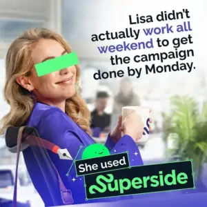
With limited elements, static Facebook ads rely heavily on a strong image-copy combo. This Superside ad nails it: Lisa’s sly smile and coffee say more than words, while the bold branding and copy frame the problem and solution in one shot. The green strip over her eyes adds cheeky humor, hinting at her clever escape from a tough work spot. Takeaway: A static ad can hit hard with minimal elements, when image and copy work together, less truly is more.
2. Slack
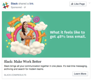
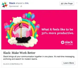
Slack’s ads grab attention fast with the line “Make work better.” Paired with playful visuals, think business suits alongside rainbows and ice cream, they highlight key pain points: time-wasting and low productivity. The bold contrast between serious and fun elements makes the message pop, while subtly pitching Slack as the go-to tool for modern teams.
3. Nike
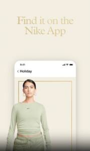
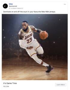
What grabs you first? LeBron with the ball, Nike knows star power sells. Their Facebook ads combine bold imagery with clean, simple design and clear messaging. One ad shows product benefits and a relatable lifestyle in a single frame, topped with a direct CTA to download the app.
4. Monday.com
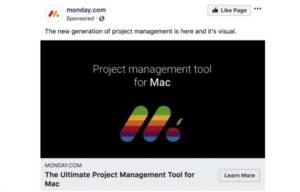
Facebook Ad Tip: Light on Dark + Smart Branding Monday.com uses light text on a dark background for instant impact. But the real win? A clever design tweak, adding Apple’s iconic leaf and colors to their logo, subtly signals Mac compatibility. A nod to a trusted brand can boost appeal. Just be sure your reference aligns positively with your audience.
5. Ford
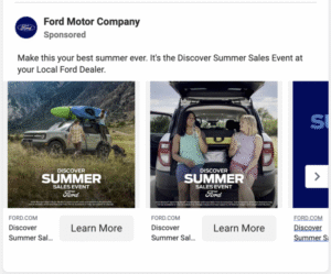
Facebook Ad Type: Lead Ad Ford’s “Discover Summer” campaign taps into adventure and emotion with imagery of kayaking and camping, paired with a limited-time offer to spark urgency. The tagline “Make this your best summer ever” ties it all together inviting users to imagine the experience in a new Ford. Emotional appeal works. Speak to your audience’s values and aspirations to drive engagement and action.
6. The Honest Company
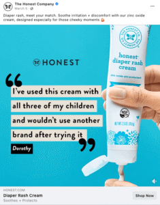
This Facebook ad works by combining a short, impactful testimonial with a clear image of the product. The bright, blank background draws the eye straight to the quote, making the message instantly clear and attention-grabbing.
7. Thrive Causemetics
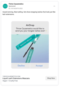
This clever graphic mimics an AirDrop notification, grabbing attention mid-scroll. It’s creative and eye-catching, assuming it’s shown only to iPhone users, not desktop or Android ones.
8. Sunday
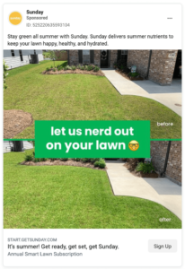
A simple before-and-after format lets the visuals speak for themselves. The minimal text guides attention straight to the lawn, highlighting the transformation effectively.
9. Mailchimp

This Mailchimp ad stands out with a clear image and value driven copy that highlights a key service benefit.
10. Rothy
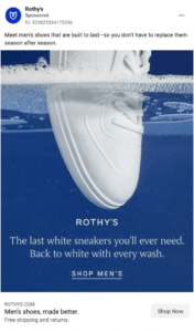
Rothy’s clearly hired a pro photographer. The unique water level angle grabs attention and lets the image speak for itself.
11. The Loan Exchange
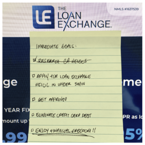
You tested an unconventional, intentionally unpolished “Lofi” static ad to see if a raw and natural look would capture attention. Designed to break typical ad norms, it used a handwritten listicle format to subtly engage the target audience and hint at solutions to their problem.
12. Sifted
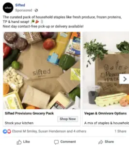
During Covid-19, Sifted promoted its grocery delivery service by highlighting its wide product range and next-day contact-free options. This led to a 5,100% increase in conversions and a 4,232% revenue boost. While demand played a role, refining ad targeting and creative drove a 972% rise in conversion rate and an 8,000% increase in ROAS.
13. Best Self Co
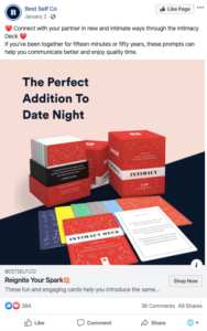
Timing can significantly impact ad performance. In January, ahead of Valentine’s Day, an ad for an intimacy deck saw an 11% ROAS increase by focusing on “date night” messaging rather than just “reignite the spark.” This approach resonated better with longtime couples seeking simple, fun ways to reconnect.
14. Fashionpile
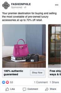
The ad led to a 27% decrease in CPA and a 76% increase in ROAS by effectively highlighting key value propositions: guaranteed authenticity, significant discounts, and a clear visual showcase of the product’s quality, color, and size.
15. Dermalogica
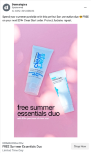
This ad uses a simple photo with basic black text to highlight the deal, while sunlight accents keep the image bright and summery to complement the product.
16. Greenlight
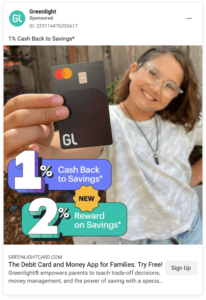
Greenlight used a camera roll-style photo of a child with a credit card, enhanced by bold numbers and bright colors to grab attention. They’re also testing a version without graphics, highlighting the importance of A/B testing in ad performance.
17. ZitSticka
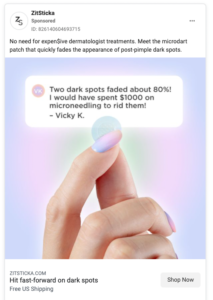
Colors can shape up to 90% of a first impression. In this ad, gentle purples, pinks, and greens subtly guide the viewer’s eye toward the product and testimonial, creating a soft yet visually appealing design.
18. Thrive Causemetics
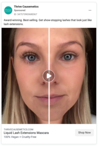
Thrive Causemetics shows the impact of a strong thumbnail. While the video simply features mascara application, the eye catching before-and-after thumbnail grabs attention, highlighting why thumbnail strategy is a key best practice.
19. Fernish
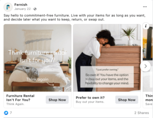
Fernish took on the challenge of addressing a buying concern in every single carousel slide. They present it with a nice image and a block of copy in the answer and question format.
20. Spotify

Your video doesn’t need to be long to be effective. This 3-second Spotify ad uses a looping animation of someone flipping vegetables in a pan, combined with short, punchy copy to quickly sell the product.
21. Canva
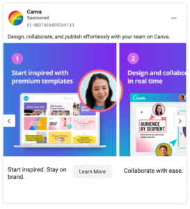
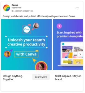
Carousel slides don’t need to match perfectly, but cohesive design can boost engagement. In this Canva example, the first slide acts as a title, followed by individual slides that each present a step in a how-to format.
22. Tushy
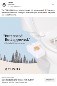
Tushy understands their product is used in a setting that can feel awkward to discuss, so they embrace it. Their playful copy helps break the tension, making the product feel more fun, relaxed, and approachable.
23. Uber Eats

This Uber Eats ad cleverly taps into a very relatable feeling. It’s empathetic marketing that validates those moments when taking care of basic needs feels overwhelming. The timing aspect (“it’s only Tuesday”) is particularly effective because it amplifies that sense of dread when you realize you still have most of the week ahead of you.
24. Toblerone
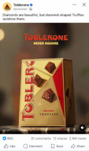
This Toblerone ad is brilliantly cheeky. What’s clever is how they’re leaning into Toblerone’s iconic triangular/diamond shape as a brand differentiator. The “NEVER SQUARE” tagline reinforces their unique geometric branding while taking a subtle jab at square chocolate pieces from competitors.
25. Heinz

This Heinz UK image ad is a bold and emotional expression of brand loyalty. The tagline “TRUE LOVE LASTS” paired with the caption “True love hurts. But it’s worth it.” cleverly ties the idea of permanent love (and a tattoo’s pain) to brand devotion. This ad smartly leverages emotion, loyalty, and bold visuals to reinforce Heinz as more than just a product, it’s a passion.
26. Sensodyne
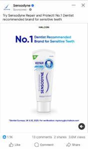
This ad effectively targets health-conscious consumers looking for reliable relief from tooth sensitivity by combining professional endorsement with a straightforward, reassuring design. It highlights the brand’s key strength with the bold claim: “No.1 Dentist Recommended Brand for Sensitive Teeth.”
27. Twix
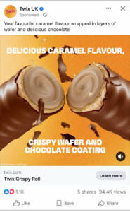
This Twix UK ad effectively showcases the Twix Crispy Roll by highlighting its key features: a delicious caramel center, crispy wafer layers, and a smooth chocolate coating. The close-up image emphasizes the product’s rich texture and indulgent layers, while the bold text and warm color palette enhance its visual appeal. Clear branding, an engaging call to action, and strong viewer engagement further reinforce the ad’s effectiveness in promoting this tempting treat.
28. Walkers
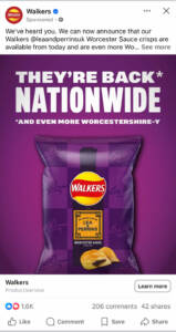
This Walkers ad is a masterclass in responding to customer demand and creating excitement around a product return. The purple packaging really pops and creates strong brand recognition. The collaboration with Lea & Perrins (the original Worcester sauce makers) adds authenticity and credibility to the flavor claim.
29. Maryland Cookie
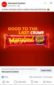
This Maryland Cookies ad is wonderfully straightforward and confident in its simplicity. The visual is striking with that bold red background that makes the package pop, and the messaging feels honest rather than overly complicated. It’s marketing that acknowledges the real relationship people have with the product rather than pretending it’s something it’s not.
30. KFC
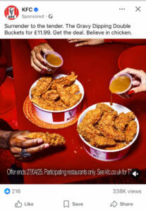
This KFC ad is brilliantly dramatic and indulgent. “Surrender to the tender” is such a clever play on words that positions eating their chicken as almost a sensual, inevitable experience rather than just a meal choice. It’s marketing that leans fully into the idea that their chicken is irresistibly good.
31. Löfbergs UK
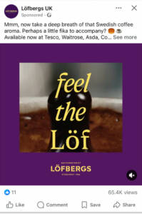
This Löfbergs ad is wonderfully sensory and immersive. “Feel the Löf” is such a clever play on their brand name that creates this almost mystical coffee experience like their coffee isn’t just something you drink, but something you experience with your whole being.
FEELING INSPIRED ALREADY with these Facebook Ad examples?
Facebook advertising is both an art and a science and as these 31 standout campaigns have shown, success comes from a careful balance of strategy, creativity, and timing. Whether it was a striking visual, a clever headline, or a well-timed call-to-action, each of these ads earned its top spot by resonating with the right audience in the right way.
We hope this collection has not only inspired you but also given you practical insights into what makes a Facebook ad truly effective. While there’s no one-size-fits-all formula, the common threads across these campaigns include; clear messaging, strong value propositions, and thoughtful targeting.
As the Facebook ad landscape continues to evolve, staying inspired and informed is key. Keep testing, keep optimizing, and most importantly, keep creating with your audience in mind. AdsforCopy is here for you.