At this point, you already know.
Instagram is more than just a platform for pretty pictures; it’s a powerhouse for brands looking to capture attention, connect emotionally, and convert fast. The best Instagram ads don’t just look good, they work. They stop the scroll, spark interest, and drive results.
Best Practices for Instagram Ads
- Hook Fast: First 3 Seconds Matter
Instagram is a scroll-first platform, so you have just a few seconds or less to stop the scroll. Start your ad with a bold statement, a compelling visual, or an emotional trigger.
- Strong Visuals Are Non-Negotiable
Instagram is visual-first. A compelling image or video will do 80% of the heavy lifting. To achieve this, use high-quality visuals, no blurry or off-brand content. Stick to a single focal point as too many elements confuse the viewer, and ensure your visuals align with your brand colors, fonts, and style.
- Keep Copy Short and Punchy.
People don’t read long paragraphs on Instagram ads, they skim. Put the most valuable benefit or hook in the first line and write like you speak: simple, clear, and benefit-focused.
- Clear, Single Call to Action (CTA)
Every ad should have one goal, and that goal should be obvious to the viewer. Common CTAs include: “Shop Now,” “Learn More,” “Download,” “Sign Up,” “Take the Quiz.” Also, CTA buttons from Meta should match your ad copy. Don’t say “Get your free sample” and then use “Learn More” as the CTA.
Creative Instagram Ad Examples
In this post, we have curated 21 real Instagram ad examples that stand out, not just because they’re visually appealing, but because they’re strategically designed to perform.
-
Fabfitfun.
Why This Ad Works
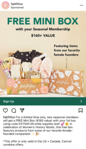
- Visually showcases the Product; The ad grabs attention by featuring a beautifully styled FabFitFun box filled with high-quality products. This visual approach helps potential customers instantly understand the value and variety they can expect, sparking interest through tangible appeal.
- Offers a Compelling Incentive; Everyone loves a good deal, and this ad delivers a strong hook: a box valued at over $160 for free. It’s a bold offer that creates curiosity and encourages clicks, even from skeptical viewers. The perceived value outweighs the initial hesitation.
- Leverages a Relevant Moment: By aligning the campaign with Women’s History Month, the ad taps into a timely and emotionally resonant theme. Supporting women-founded brands adds depth to the message and aligns with the values of socially conscious consumers, making the offer feel even more meaningful.
2. Wix
Why This Ad Works
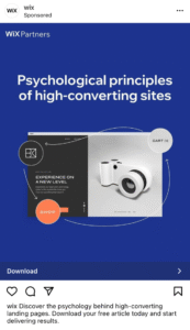
- Artful Clarity Through Abstraction: The use of an abstract-style infographic brings sophistication and creativity to the ad. It delivers information in a clean, visually engaging way, guiding the viewer’s eye without clutter. This combination of form and function makes the concept both aesthetically appealing and easy to understand.
- Color Psychology: Navy conveys trust and professionalism, while tangerine adds excitement and warmth. Together, they build both credibility and energy.
- Visual Hierarchy: The strong contrast naturally leads the eye to key information. Design Intelligence: The abstract infographic adds a modern, artistic touch that reflects Wix’s brand as both innovative and user-friendly.
3. Elementor
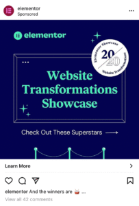
Why This Ad Works
- Vibrant Visual Contrast: The striking navy and turquoise palette creates a bright, high-contrast look that demands attention in Instagram’s fast-scrolling feed. The color combo is both modern and eye-catching, helping the ad stand out instantly.
- Sharp, Straightforward Messaging: The copy is clear and to the point, making it easy for viewers to grasp precisely what they’ll get by clicking the call to action; no fluff, just value.
- Curiosity-Driven Engagement: By teasing a “website transformations showcase” without revealing any actual examples, the ad introduces just enough mystery to spark interest. Viewers are left intrigued, motivating them to click through and explore the landing page to satisfy their curiosity.
4. McDonald’s
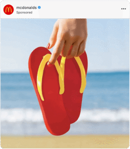
Why This Ad Works
- Brand Recognition Without the Logo: This McDonald’s ad masterfully demonstrates the power of visual identity. Despite having no logo or name, the imagery is instantly recognizable, proof of how iconic the brand’s elements have become.
- Minimalism Meets Creativity: Celebrating the first day of summer, the ad uses clever, stripped-back visuals to capture attention freshly and unexpectedly. It’s a brilliant example of how thinking outside the box can lead to captivating yet straightforward content.
- Strategic Seasonal Messaging: Beyond creativity, the ad serves a clear purpose: keeping McDonald’s top of mind. By tying into a seasonal moment, it subtly reinforces the brand’s presence without a hard sell.
5. Yoga International

Why This Ad Works
- Interactive by Design: One of the most significant advantages of Instagram Story ads is the ability to make them interactive using features like poll stickers. This simple touch invites engagement, drawing viewers in while making the content feel more native, just like any regular Story, not a traditional ad.
- Proven Impact: Yoga International tapped into this strategy with a series of Story ads, and it paid off. A single poll sticker contributed to 18% of total sign-ups during the campaign, highlighting just how powerful interactivity can be.
Feels Native, Not Promotional: Mimics organic content, reducing ad fatigue.
6. WGSN

This Instagram ad appears to be effective for several reasons;
- Visually Striking and Unique Creative: The image of a person with leaves growing out of their head is surreal and attention-grabbing. It’s not a typical product shot or a generic stock photo, making it stand out in a user’s feed.
- Clear and Engaging Message: “Create Better: Innovating Towards a Sustainable Future” is a strong headline that immediately communicates a positive, forward-thinking message. It’s not just about a product, but about a larger goal.
- Strong Call to Action (CTA): The “Download now” text with the accompanying arrow is clear and easy to understand. It tells the user exactly what action to take.
7. Optimonk
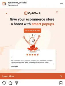
This ad for Optimonk also demonstrates several effective advertising strategies, particularly for a B2B (business-to-business) or SaaS (Software as a Service) product. Here’s why it works:
- Clear Value Proposition: “Give your e-commerce store a boost with smart pop-ups.” This headline immediately tells the target audience (e-commerce store owners) what the product does and how it benefits them. It addresses a common pain point needing to “boost” sales or engagement.
- Benefit-Oriented Language: Instead of just saying “use our pop-up software,” it focuses on the outcome: “give your e-commerce store a boost.” This resonates more with businesses looking for tangible improvements.
- Strong Call to Action (CTA) & Low Barrier to Entry: “Try for Free for 30 Days” is a highly effective CTA. Offering a free trial significantly reduces the risk for potential customers, making them more likely to try the product.
8. Beautybay
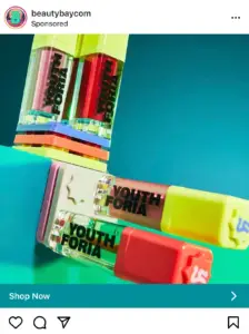
This Instagram ad for “Beautybay” is effective for several reasons:
- Visually Captivating Product Photography: The products themselves are brightly colored (neon greens, pinks, oranges), and they are set against a striking teal background. This creates a high-contrast, eye-catching image that immediately stands out in an Instagram feed, which is often filled with more subdued or natural tones.
- Brand Identity & Target Audience Alignment: “Youthforia” as the Product name itself suggests a target audience interested in youthfulness, vibrancy, and perhaps a playful approach to beauty. The bright colors of the products align perfectly with this.
- Clear Call to Action (CTA): “Shop Now” Button is a direct and standard e-commerce CTA. It tells the user what action to take if they are interested, providing a low-friction path to purchase. The arrow further emphasizes the action.
Also check: 31 Facebook Ad examples that ranked No.1
9. Kielhs
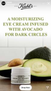
This Kiehl’s Instagram ad works well for several reasons:
- Clear Value Proposition The headline immediately tells viewers what the product does: “A moisturizing eye cream infused with avocado for dark circles.”It highlights the product’s benefits (moisturizing, targets dark circles) and a natural ingredient (avocado) that appeals to health-conscious consumers.
- Strong Visual Appeal The image of a fresh avocado next to the cream reinforces the natural, nourishing theme. The clean, minimalist background draws attention to the product and the message without distractions.
- Brand Recognition The recognizable Kiehl’s logo is placed at the top, immediately lending credibility and trust to the ad, especially among loyal or familiar customers.
10. Hostinger Global
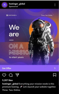
Why this ad works
- This ad works for Instagram because it immediately captures attention with bold, vibrant colors that stand out in the feed.
- The space and astronaut theme adds a sense of excitement and ambition, aligning perfectly with the brand’s global mission.
- Visually cohesive and imaginative, it turns a tech service into an engaging, scroll-stopping story.
11. Doodly

Why this ad works
- This Instagram story ad works because it delivers its message instantly with clear, bold text that highlights the value and offer.
- The minimalist design keeps the focus on the key points without distraction.
- The green chalkboard background and white writing create a strong contrast, reinforcing brand identity while grabbing attention.
12. Iconscout
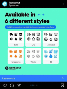
Why this ad works:
- This Instagram ad by Iconscout works because it transforms a simple product into a visually engaging experience by showcasing variety in style.
- The consistent grid layout and vibrant colors create a clean, eye-catching presentation.
- Most importantly, it effectively communicates the product’s versatility without needing words.
13. Leadpages
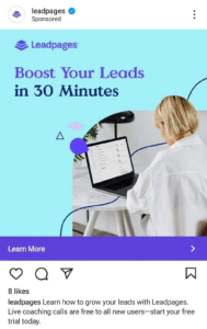
Why this ad works
1. Clear and Compelling Headline “Boost your leads in 30 minutes” is a bold, benefit-driven statement that instantly grabs attention. It speaks directly to a common pain point, generating leads quickly and offers a time-specific solution, which adds urgency and appeal.
- Strong Value Proposition The ad isn’t just promoting a tool; it’s offering free coaching calls for new users. This added incentive lowers the barrier to entry and makes the offer more attractive, especially for beginners who might need guidance.
- Action-Oriented Design Visually, the ad is likely clean and uncluttered (typical of high-performing Instagram feed ads), allowing the message to shine. The CTA (call-to-action) is clear: install, sign up, and get started, which aligns perfectly with Instagram’s quick-scroll behavior.
14. Heap
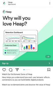
Why this ad works
- Curiosity-Driven Hook By starting with a question, the ad immediately taps into the viewer’s natural desire to find answers. This strategy stops the scroll and invites introspection, encouraging users to consider their own data or analytics challenges right before Heap offers a solution.
- Minimalist, Focused Design. With just one clear sentence on the ad, the message is streamlined and easy to digest. In a noisy feed environment, less is more, and this approach helps the ad cut through clutter, demanding attention without overwhelming the viewer.
- Smooth User Journey The CTA invites users to “watch the demo”, not “sign up” or “buy now.” That’s a low-commitment ask, which reduces friction and increases the likelihood of engagement. It gives potential customers a chance to explore without pressure, which is ideal for B2B or SaaS products.
15. Shopify
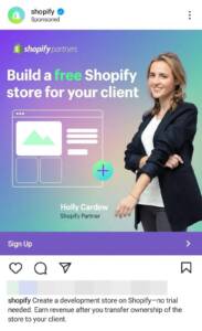
This Shopify Instagram ad works for several key reasons:
- Powerful Use of the Word “Free” The word “free” is one of the most persuasive triggers in marketing. Shopify puts it front and center, literally and visually. Its placement near the center of the ad and its vibrant turquoise color make it impossible to miss. This instantly draws attention and lowers resistance from the viewer.
- Clean, Minimalist Design The ad is simple, with no unnecessary clutter. This ensures that the message is communicated instantly, even in the fast-scrolling Instagram environment. The clean design also aligns with Shopify’s brand image: professional, easy-to-use, and modern.
- Visual Context with Wireframe
Instead of using stock images or generic visuals, the ad includes a wireframe of a website. This gives viewers a real sense of what they can do with Shopify, specifically building a store. It visually reinforces the product’s value without needing lengthy explanations.
16. Coopsleepgoods
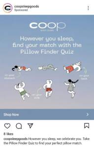
Why this ad works
- Disrupts the “Ordinary” Mindset: Most people see pillows as generic, interchangeable products. This ad flips that assumption by asking, “Do you have the right pillow?” That simple question sparks self-doubt and curiosity, two powerful motivators in advertising.
- Interactive Call to Action: The Quiz. By offering a pillow quiz, the ad invites the viewer into an experience rather than just promoting a product. Quizzes feel low-pressure but highly personal, which increases engagement and makes the customer more invested in the final recommendation.
- Emotional Hook: The idea that you may have been sleeping on the wrong pillow for years subtly taps into discomfort or sleep issues the viewer may already be experiencing. It offers Coop’s product as a smart, corrective step toward better rest.
17. Cowboy
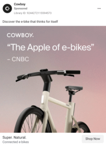
Why this ad works
- Credibility through association: Quoting media that refers to the brand as “The Apple of e-bikes” instantly communicates innovation, quality, and desirability. It leverages Apple’s reputation to transfer prestige and trust onto Cowboy.
- Premium, minimalist design: The ad’s visual elements, which consist of a clean background, sleek product design, and soft lighting, create a high-end feel. It echoes the visual language of luxury tech brands, subtly reinforcing the idea that this isn’t just a bike, it’s a statement.
- Emotional over rational appeal: By focusing on the feeling of owning the product (sophistication, exclusivity, modernity) instead of technical specs, the ad taps into aspiration. This draws in customers who buy based on identity and lifestyle, not just function.
18. Bruvi
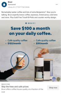
This Instagram ad by Bruvi works for several reasons:
- Highlights real financial benefit: By comparing café costs ($152/month) to Bruvi’s lower price ($39/month), the ad makes the value instantly obvious. The savings are not abstract; they’re concrete and relatable.
- Visual clarity and impact: With a bold, easy-to-read headline and a clean side-by-side pricing layout, the viewer’s attention is guided straight to the key message. There’s no clutter, just a powerful comparison.
- Persuasion through simplicity: This is a textbook example of effective advertising. The message is streamlined: great coffee, less money. That framing makes the switch feel not only clever but almost inevitable.
19. Out in London
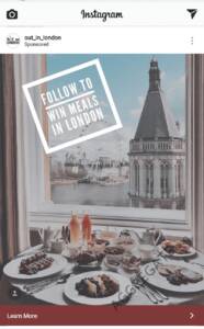
This Instagram ad from Out_in_London works effectively because of several well-executed elements:
- Irresistible Offer The main message, “FOLLOW TO WIN MEALS IN LONDON,” is simple, direct, and high-value. It offers a tangible, desirable reward (free meals) that aligns perfectly with their target audience, food lovers, and London locals/tourists.
- Eye-Catching Visuals: The image of a luxurious breakfast overlooking a scenic London skyline (with the London Eye visible) instantly creates aspiration and a sense of indulgence.
- Text Placement & Contrast: The call-to-action text is placed prominently within a bold white frame, helping it stand out against the busy background.
20. Gurushots

This Gurushots ad works effectively for several reasons, particularly given its target audience of photography enthusiasts:
- Strong, Benefit-Oriented Headline: *”THE WORLD’S GREATEST PHOTOGRAPHY GAME” as the headline is bold, confident, and immediately communicates the core value proposition. It appeals to a desire for mastery and competition within the photography community. The use of “greatest” creates intrigue and a sense of aspiration.
- Visually Compelling and Relevant Image: The image itself is a stunning long-exposure photograph, likely depicting light trails, which is a classic and aesthetically pleasing photography technique. Presenting it within a smartphone screen immediately communicates that this is a mobile-first experience or an app related to photography.
- Clear Call to Action (CTA): * “Install Now”: This is a direct and unambiguous CTA for an app or game. It tells the user precisely what to do to engage further.
21. The Dots
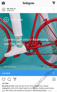
This Dot Instagram ad works for a few key reasons, despite its minor readability issue:
- Visually Captivating: The colorful background grabs attention quickly while scrolling through a crowded Instagram feed. Bright, vibrant visuals help stop the scroll.
- Embedded Value Proposition: Placing the value proposition directly in the image ensures the message is immediately visible, even if users don’t read the caption. This makes the ad more self-contained and impactful.
- Aesthetic Cohesion: The overall design feels modern and sleek. The layout, typography, and colors are harmonious, which enhances brand perception and professionalism.
Whether you’re a marketer, creator, or small business owner, these examples will inspire better ads and, consequently, better outcomes. Great Instagram ads don’t happen by accident; they’re a mix of innovative creativity, clear messaging, and strategic thinking. As you’ve seen from these 21 examples, the most effective ads grab attention quickly, speak to a specific need, and drive a single action.

